What’s a Print Panel Competition?
Our Print Panel Competition is next Thursday, 6th April, and our newer members might be wondering what on earth that means – so here’s a quick explanation.
The competition is open to all members, not restricted to any class, and it means putting together a ‘panel’ of between three and six separately mounted images that are united by a theme. The theme can be literal or abstract, such as Chichester Cathedral, Snowdrops, Red, Memories of Ireland or Reflections for instance. They can be any genre – landscape, portrait, documentary, floral or creative etc. If you use a technique such as ICM though, don’t include that in the title, it’s not required.
The images need to work well together, which is what we mean by ‘panelling’. So they should have a common colouration, have the same the same, or balanced aspect ratios and all mounted in the same way. You need to bring them in a loose bag – please don’t ever submit images to this or the Annual Exhibition that have the wrapping stuck down, or in individual print envelopes – and simply put them on the table you’ll find by the stage.
There is one thing you need to do that is a bit more complicated – you must submit a ‘hanging plan’. That is a layout of the way you want your images to be presented. You can make a hanging plan in lots of the software programmes we use for our photography (I use LightRoom), in Word (which I find really frustrating!), in PowerPoint (easier than Word) or even simply lay them out and photograph them. The purpose is to ensure that your images are displayed as you want them to be. One copy of the hanging plan needs to go in the bag with your prints, a second copy needs to be handed in lose, this copy needs to have your name on the BACK, along with the theme title. The judge will preview these before seeing the panel in situ. Our judge this year is Chris Palmer, a regular visitor and good friend to the Club who was also our Annual Exhibition judge last year.
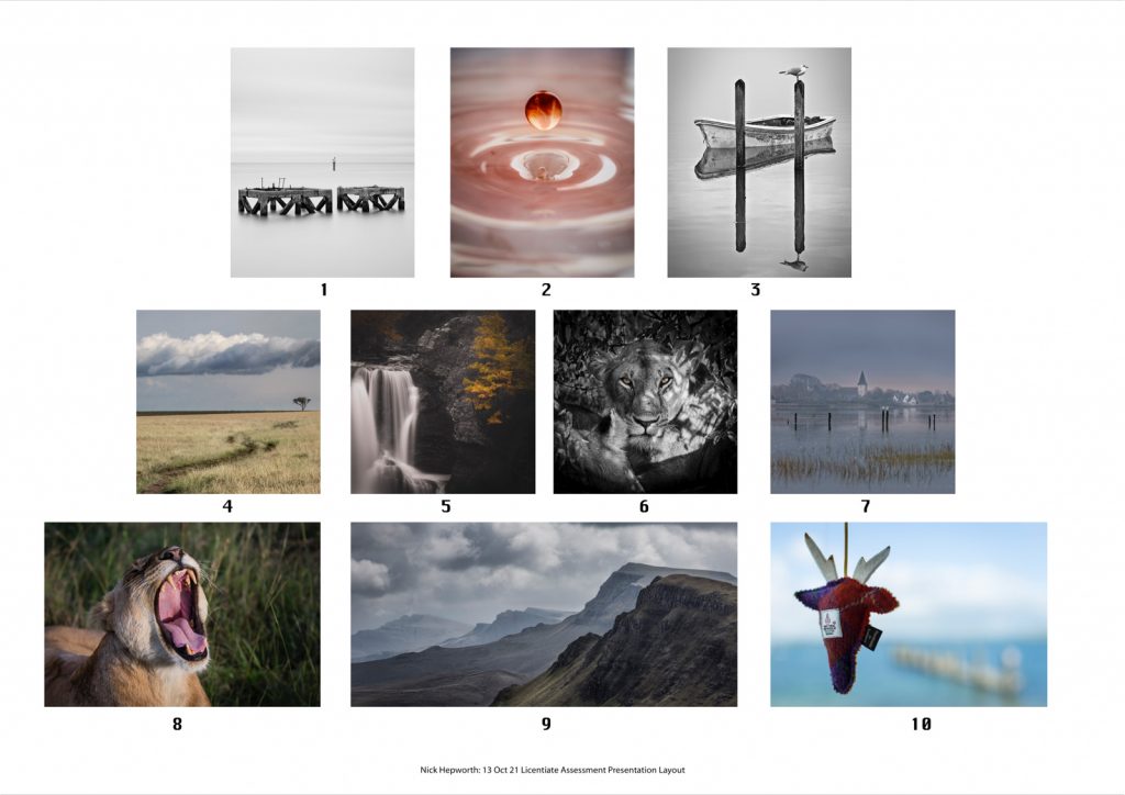
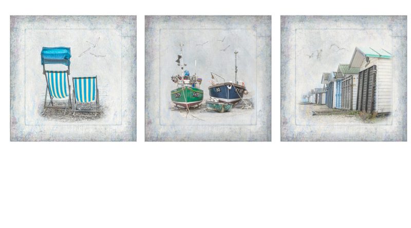
You can see an example of a hanging plan for three images in the featured image above, which are mine and would be titled ‘Coastal’. And simply as another example, below you can see a hanging plan for 10 images from Nick Hepworth’s LRPS submission, which shows how he balanced different images in a cohesive and harmonious way. The principle is just the same, to show which order and in how many rows your three to six images should be presented. The complete rules for the competition can be seen at the link below.
Chris will select the winning panel and second and third places – the winner will be awarded the Shubotham Cup and their panel will feature at the Annual Exhibition in August.


